Designing a child myopia management mobile application for an international audience
Project background
Child myopia is a global epidemic and a growing health risk that is often under-appreciated by parents. Children in the first wave of high myopia prevalence (those born after 1970) are now on the cusp of experiencing sight-threatening complications as adults. In order to educate the parents and equip them with the tools to manage their child’s myopia risk, J&J wanted to build a trusted and personalised eye-health digital ecosystem that connects parents and their children to eye care professionals globally.


Deliverables
Feature reviews, sitemap, user journey map, design pattern library, user flows and mobile application design


Download the SeeAbiliti app (beta)
Google Play Store: https://play.google.com/store/apps/details?id=com.jnj.seeabiliti&hl=en_SG&gl=US
Apple Store: https://apps.apple.com/sg/app/seeabiliti/id1568962995
My roles
Lead product designer
Visual designer
And all other adhoc roles...
YEAR OF PROJECT
2021 - Current
Product launch
4 countries and 3 languages – USA, Singapore, Hong kong, Canada
As part of the myopia management ecosystem, a mobile application for parents was created
Our target users are parents with myopic children, age 6-12 years old
Project CHALLENGE
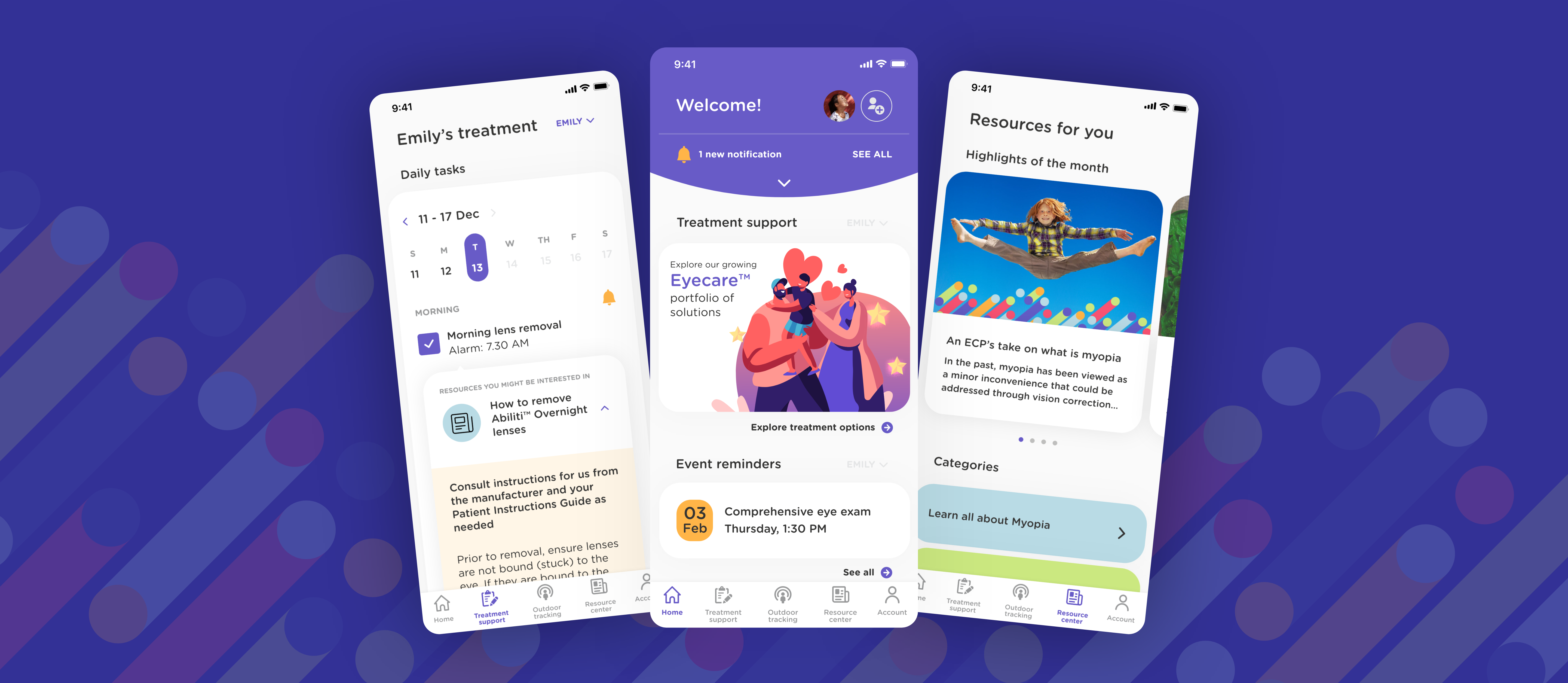
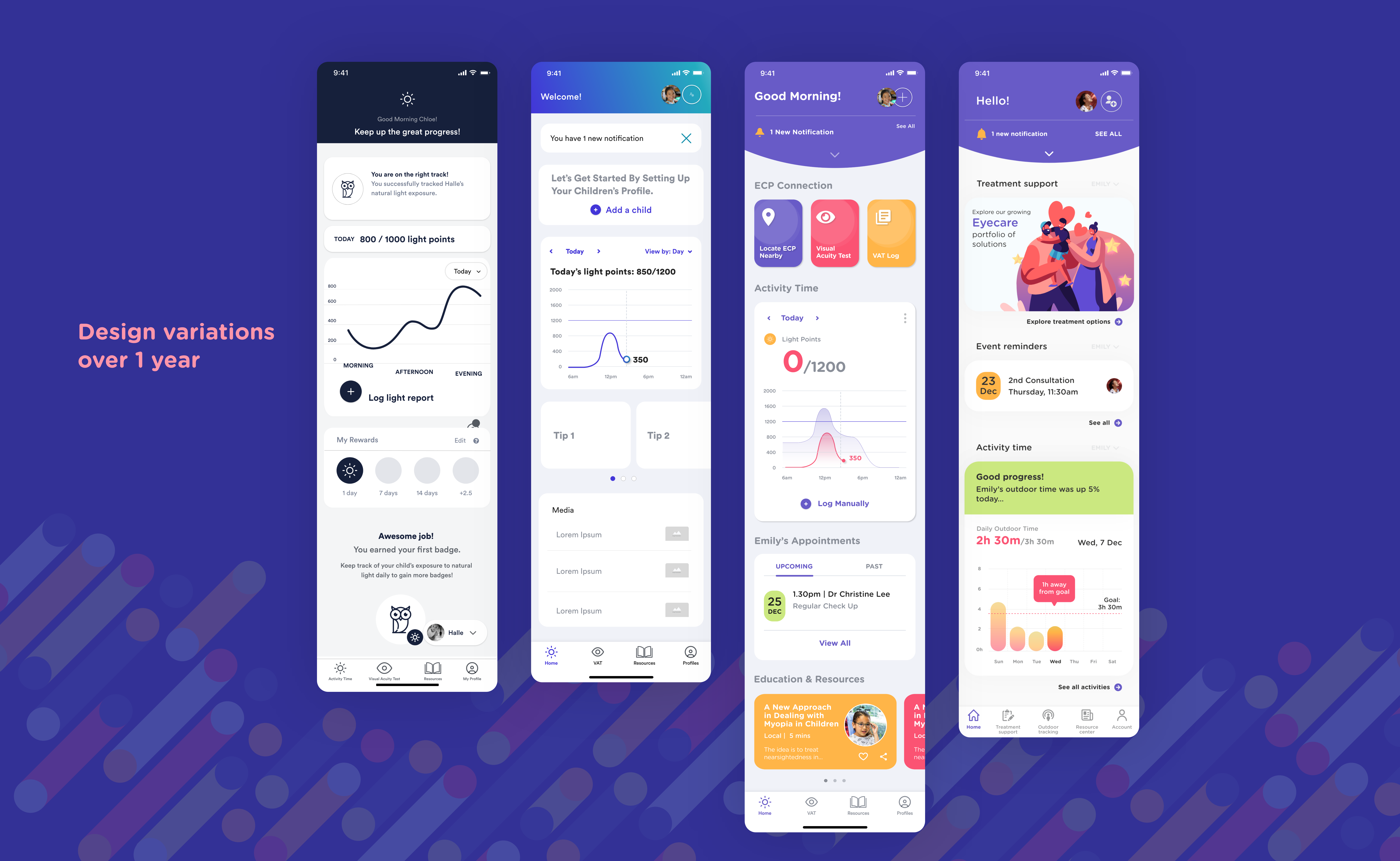
As part of the digital ecosystem, we were tasked to design a mobile application for parents with myopic children, aged 6 to 12. The goal was to establish a personalised approach to myopia management. Some of the main features include tracking of children’s myopia treatment plan, managing of their eye appointments and providing useful resources related to their child’s myopia treatments.
We were introduced to the project after the discover & define phases, and right into the design phase.


objectives
To design and launch an Android and iOS app in 2 main markets within 1 year. To strengthen J&J Design Lab’s partnership with J&J Visioncare and to work on more projects in the Myopia digital ecosystem.

As this is still an ongoing project, I will not be able to showcase the designs in detail but only some of the challenges and solutions faced along the way.


challenges and solutions
1. Working in a business-led organisation
As a designer who has a strong foundation and belief in a design-led approach, the biggest challenge I faced in this project as a design lead is to acclimatise quickly to the working style of a business-driven organisation. It took us almost a year to convince and adapt our working styles to meet at a middle ground. 

As we were introduced to the project after the research phase, the direction of the app, its target users and the app features were already decided by the business team. We were brought in to execute the designs based on their decisions.  

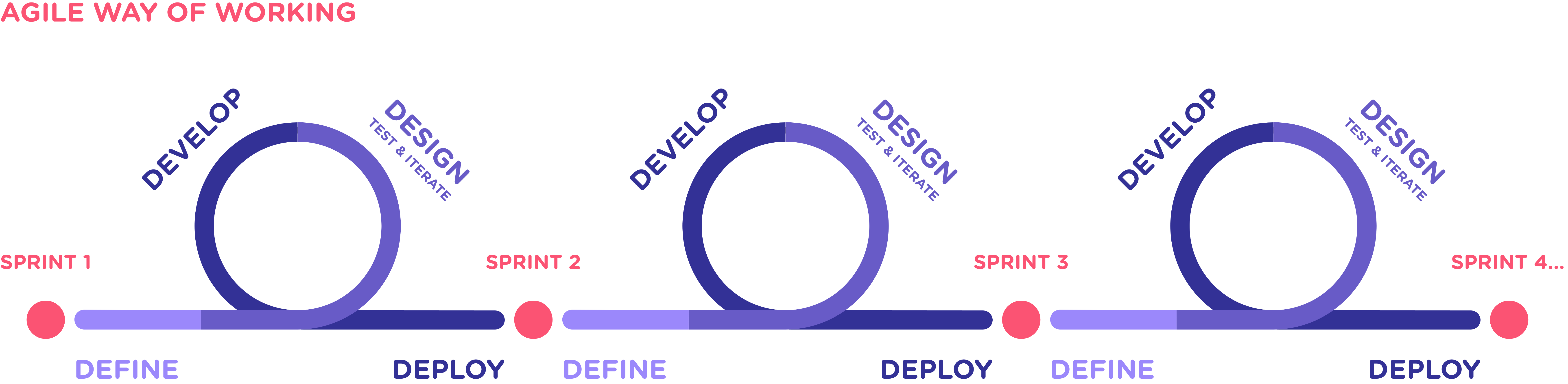
Initially, every sprint would start with a working session with the business team to get a better idea of how they envisioned the feature would work. I would then do some desktop research to look for inspirations, create some mid-fidelity designs and then present to the team with at least two design variations to choose from. A design would be selected based on the direction of the business team and technical feasibility inputs before handing it off via Zeplin to the developers.

2. Absence of budget and time for proper user validation

Although the team works in an agile fashion, the lack of a design-led approach has created gaps in the working process. For one, because the approach was to "launch quickly and learn", we were not expected to carry out user testing during our design process. This has often led to many assumptions and we are not entirely sure if these are features that parents need.

As much as business objectives are important, I felt my responsibility as a designer to represent the voice of the user through informed design. During the earlier period of the project, I was determined to introduce quick user testing even when we were on a tight sprint plan and had no budget for testing.

Instead of following the proposed sprint schedule, I pushed and led a new plan that included quick user testing and design iterations:
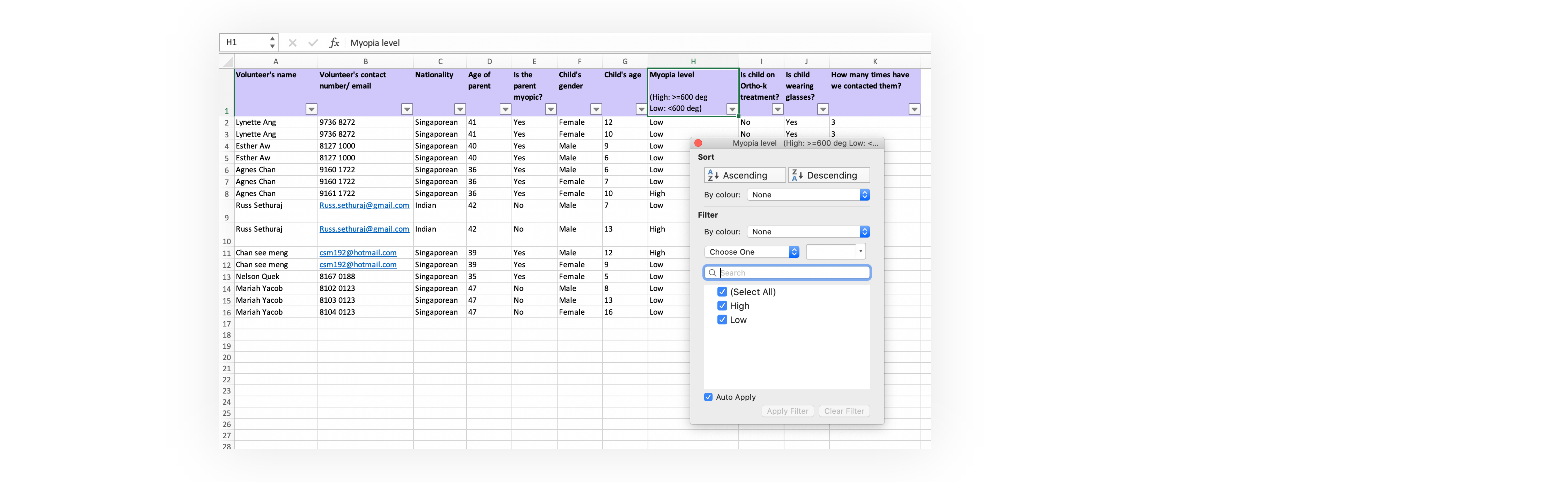
Even though far from ideal, I took the initiative to recruit a group of 7 parent volunteers from my own contacts. And in hope of encouraging the team to contribute volunteers and undertake their own mini user testing, I also created an excel database to allow my teammates to quickly add new volunteers and filter between criteria to identify suitable users for different testing purposes:
An excel sheet that we use to sort and filter out parent volunteers for our quick user testings
For example, we initially designed the settings to be hidden behind a cog icon, thinking that users would naturally prefer the conventional presentation. However, we were challenged by our developers who suggested that it might be too much of a hassle for users if the settings were behind 3 to 4 clicks from the home page.

True enough, we did a quick testing with 6 users and found out that 4 parents preferred to see the settings upfront, as there were not many settings in the first place. There was no need to further categorise the settings.
We had to test out different design layouts for the Settings page with our parent volunteers
3. Web accessibility: Brand colours that are not WCAG 2.1 compatible
For this project, we inherited a set of brand colours created for print materials, which was not digital-friendly. As we were striving for WCAG AAA standard in our designs, the chosen palette had a limited colour combination that we could use.

I wanted to expand each primary brand colour by introducing two secondary hues, creating a total of three hues each. Using different colour palette recommendation tools from Google, Ant and Adobe, I was able to retrieve many different compatible colour palettes based on the primary colours. The next step was to see if the colour combinations pass the AA/AAA standards.

In order to quicken the process, I worked with my husband to write a Python script to extract the contrast ratio between two colours and an excel VBA script to visualise all the various palettes that passes the AA/AAA standard. The team was also involved by voting for their favourite colour palette during a design critique session, giving rise to a digital-friendly colour palette that we could use for the entire Myopia digital platforms.

The images below show how I went from checking the brand colours manually to using an excel to speed up the process. If a particular colour combination passes the AA/AAA standard, the contrast number will be shown to indicate that it is ok to use in our designs.
Checking for colour palettes that pass the WCAG 2.1 standard: My process evolved from carrying out manual checks to one that is automated on Excel
4. Working as a team of 3… from home
With the team working from home due to the COVID19 pandemic, there was a need to create and maintain an updated component library on the cloud so that the latest components that I have created were being used consistently throughout the designs. The importance of using a cloud software (and library) became more apparent when two more designers joined me in this project. As this was also my first time using Adobe XD rather than Sketch, which I was more proficient in, we had to figure out how the cloud library works.

And because of the limited visibility, the component library was always a work in progress as there were many times that we had to rework the design based on the business team’s direction.

Another challenge was to make sure that the components were scalable to future design needs.
A design component system that was created and stored on cloud for the ease of WFH collaboration


impact: Measuring success beyond KPI
One year since we started this project, the current mobile application had been developed and is preparing to be launched within the next month in two markets.Moreover, the trust and respect that we had gained from working closely with our business team has landed us 3 more projects within the myopia eco system next year.
Mindsets of our clients and relationship managers
On a personal note, there were too many takeaways on this fast-moving project. Apart from improving my design skills on a new software platform, I had the chance to wear multiple hats as a visual designer, project manager and a lead project designer. And instead of only focusing on our users, my biggest lesson was to also understand how our partners work and their needs to deliver, and sometimes that means going with decisions that have not undergone the rigour of user testing.Or as my boss eloquently put it: learning how to ride on a rocket as we are building it. And with the results we have showed, we have gained the trust from our stakeholders to incorporate elements of a design-led approach and find a middle ground approach to building a product.
Other case studies...
This portfolio is confidential. Please do not distribute without permission.
xinyuan14@gmail.com