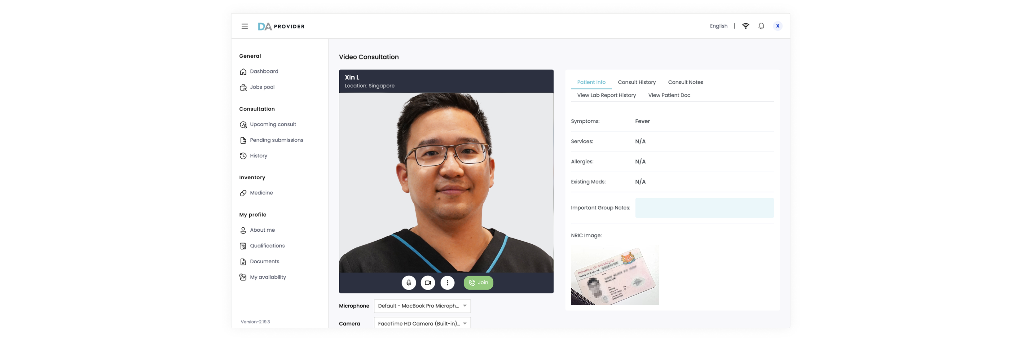
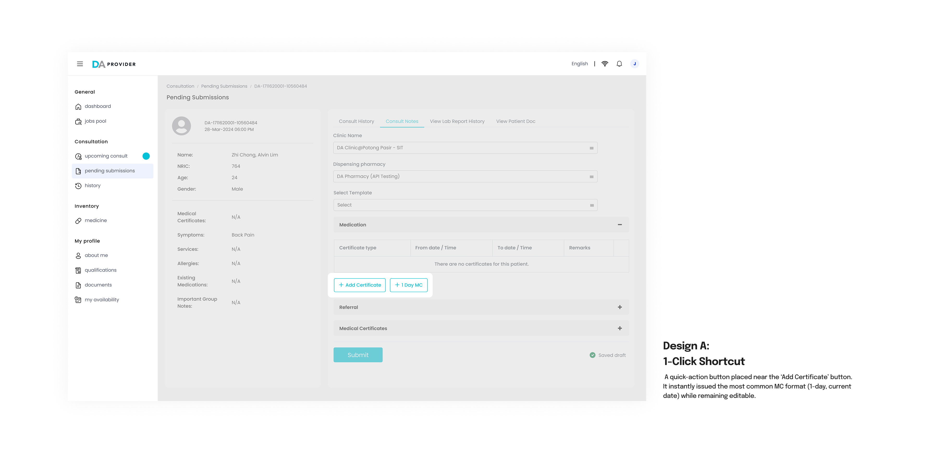
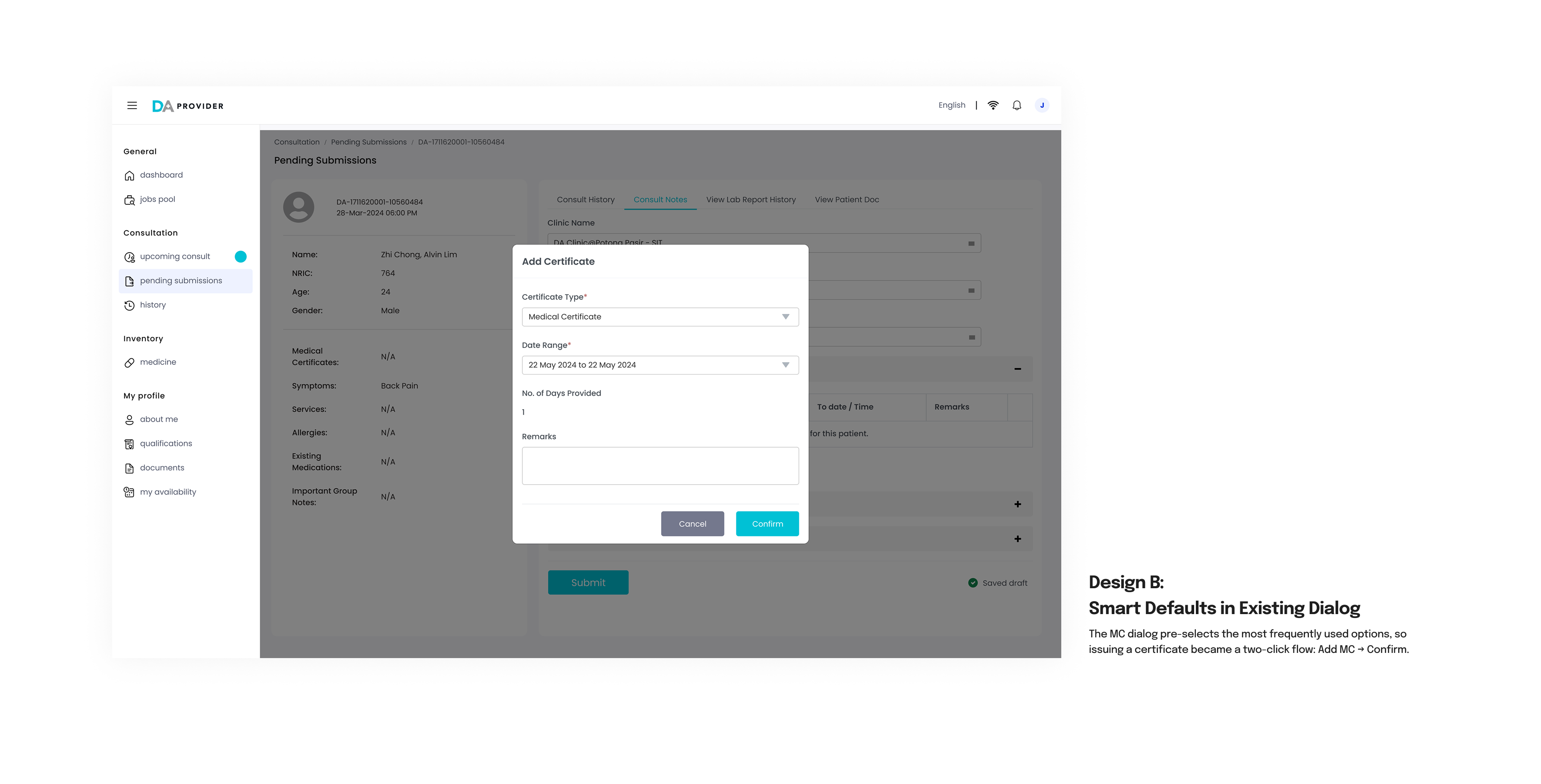
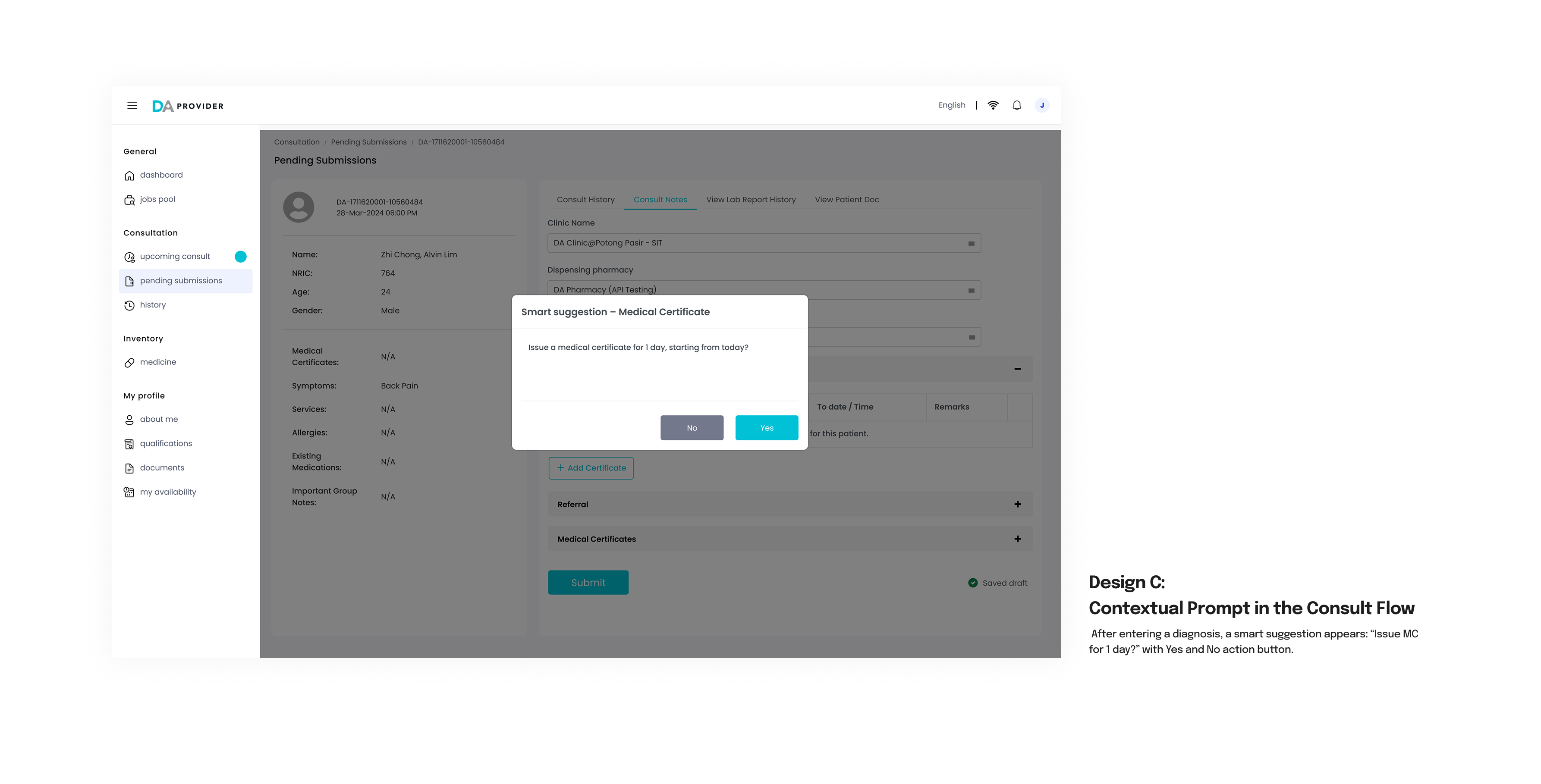
Doctor Anywhere — Redesigning the doctors' platform for doctors in Southeast Asia
Project background
As the sole product designer, I led the redesign of Doctor Anywhere’s provider platform—a desktop and mobile tool used daily by ~290 doctors across Southeast Asia to conduct video consults, write notes, track KPIs, and issue medical certificates.

This was a high-impact, efficiency-critical platform that directly influenced doctor's earnings, retention, and business revenue. Despite its importance, the product was weighed down by outdated UX, clunky workflows, and years of tech debt.

I collaborated with remote engineers, a PM, and stakeholders to audit the experience, prioritize high-impact fixes, and ship measurable improvements under tight constraints. This case study reflects my strengths in product thinking, business-driven design, and cross-functional execution.


impact
- ⏱️ +40% consult efficiency (5 → 3 mins)
- 💬 +24% consults per doctor
- 📈 +10% Monthly Active Doctors
- 💰 >$530K/month revenue growth
- 🏥 +3,300 clinical hours saved/month
My role
Senior Product Designer
YEAR OF PROJECT
2024 - 2025
Product launch
5 countries in Southeast Asia
Doctor's platform – This image shows the video consultation page, before a doctor joins a call
One of the user interviews with a locum doctor which was conducted at his clinic
Project CHALLENGE
The doctor platform hadn’t been meaningfully updated in years. It was outdated, and regularly received complaints from doctors about inefficiencies—especially during high-traffic hours.
The challenge was to modernize the platform without overhauling the backend, identifying quick, high-impact UX wins that could improve efficiency and retention while working within tight technical constraints.


our users – Doctors
In Singapore alone, ~290 doctors actively use the platform across desktop and mobile.
Our users include both full-time DA and locum doctors, many of whom work across competing telehealth platforms. Their performance-based earnings depend on metrics like consultation volume and patient ratings, making speed and usability critical. A slow or inefficient platform directly impacts their ability to meet KPIs and, by extension, their income. Because locum doctors can easily switch telehealth providers, creating a smoother, faster, and more reliable experience was also key to retaining doctors and reducing churn.


my approach
To ensure our redesign addressed real user needs and business goals, I took a mixed-methods approach:
- Conducted 7 user interviews over 3 weeks to understand mental models and frustrations
- Audited the existing UX and analyzed click data to identify underused or inefficient features
- Reviewed feedback from the Provider Web Feedback form
- Benchmarked competitor platforms and UI/UX best practices
- Mapped insights to the product backlog, prioritizing improvements that aligned with our 2024 OKRs


key insights
1. Credibility and usability retain high-performing doctors
Doctors preferred DA over competitors for its patient quality and cleaner UI, which helped them uphold professional standards and meet KPIs.
2. To the doctors, efficiency is everything
Doctors compete for jobs across multiple platforms and rely on third-party tools (e.g. auto-clickers, custom note libraries) to meet KPIs. Our redesign focused on speeding up common actions, minimizing switching costs, and removing friction in the consultation and case-picking process.
3. Liability and KPI pressure influence decision-making
Some doctors avoid complex cases, especially toward the end of their shift, to protect their KPIs. Our platform lacked ways to support this behavior fairly—so we explored design changes that make patient case complexity more transparent without penalising the doctor.


designs and iterations
Based on the insights gathered, we identified multiple opportunities to streamline high-friction workflows, reduce cognitive load, and support doctors in meeting their KPIs more efficiently. While many areas were improved, I’ve chosen to showcase two representative scenarios that reflect how small but strategic UX changes can lead to meaningful impact at scale: auto-saving consultation notes and streamlining the issuance of medical certificates (MCs).
💾 1. Saving Consultation Notes (Trust and Recovery in High-Pressure Moments)
Doctors needed reassurance that their notes were reliably saved, especially in the event of network instability. Many worried about losing notes during disconnections or platform crashes. Every moment of delay means lesser chance of taking another case and not meeting their KPIs in the highly competitive environment.

I explored three design variations:


What was shipped: I implemented Design A, the inline status indicator, as it provided clear, real-time feedback without disrupting the workflow—especially valuable during fast-paced consultations. Doctors preferred DA over competitors for its patient quality and cleaner UI, which helped them uphold professional standards and meet KPIs.
📝 2. Issuing Medical Certificates (Reducing Repetition in a High-Frequency Task)
Writing MCs is a common step in almost every consultation, yet the original process was tedious and takes up time: doctors had to manually open a dialog, select certificate type, and choose dates each time. I explored the following solutions:
A design component system that was created and stored on cloud for the ease of WFH collaboration

What was shipped
: We shipped a hybrid of Designs A and B—a 1-click shortcut for speed, and smart defaults for flexibility. This reduced friction without adding UI clutter or compromising accuracy.


what else?
Beyond the two scenarios showcased, we identified and prioritized a broader set of UX improvements across four key areas:
- Increasing completed consults
- Improving patient care
- Consult efficiency enhancements
- Miscellaneous/hygiene fixes

These ranged from minor UI tweaks to deeper systemic changes affecting workflow logic and platform incentives.
Some ideas—such as auto-assigning patients to doctors instead of letting them choose—required larger cross-functional alignment. While it could reduce drop-off and increase completed consults, it also introduced questions around risk, fairness, and clinical safety. These decisions couldn’t be made by design alone and became part of ongoing product and policy discussions.


Project impact
- ⏱️ +40% consult efficiency (5 → 3 mins)
- 💬 +24% consults per doctor
- 📈 +10% Monthly Active Doctors
- 💰 >$530K/month revenue growth
- 🏥 +3,300 clinical hours saved/month


Challenges I FACED
One of the biggest challenges was working within tight engineering constraints—many of the improvements had to be scoped carefully due to tech debt and limited backend flexibility. Prioritizing what to fix, and when, required constant negotiation with product and engineering to ensure we were focusing on changes that delivered the highest impact with minimal build complexity. At the same time, we had to balance doctor feedback, business goals, and operational needs—often making trade-offs between ideal UX and what was feasible to ship incrementally.


learnings
This project emphasized mastering the synthesis of qualitative insights and product data to prioritize high-impact design. I learned to assess decisions not just for usability, but for their direct influence on core business metrics (e.g., improving consultation volume, efficiency, and doctor retention). Working with a remote engineering team reinforced the value of clear documentation and disciplined scoping—ensuring we delivered maximum value with minimal complexity and successfully scaled thoughtful UX improvements to our massive user base.

Other case studies...
This portfolio is confidential. Please do not distribute without permission.
xinyuan14@gmail.com